|
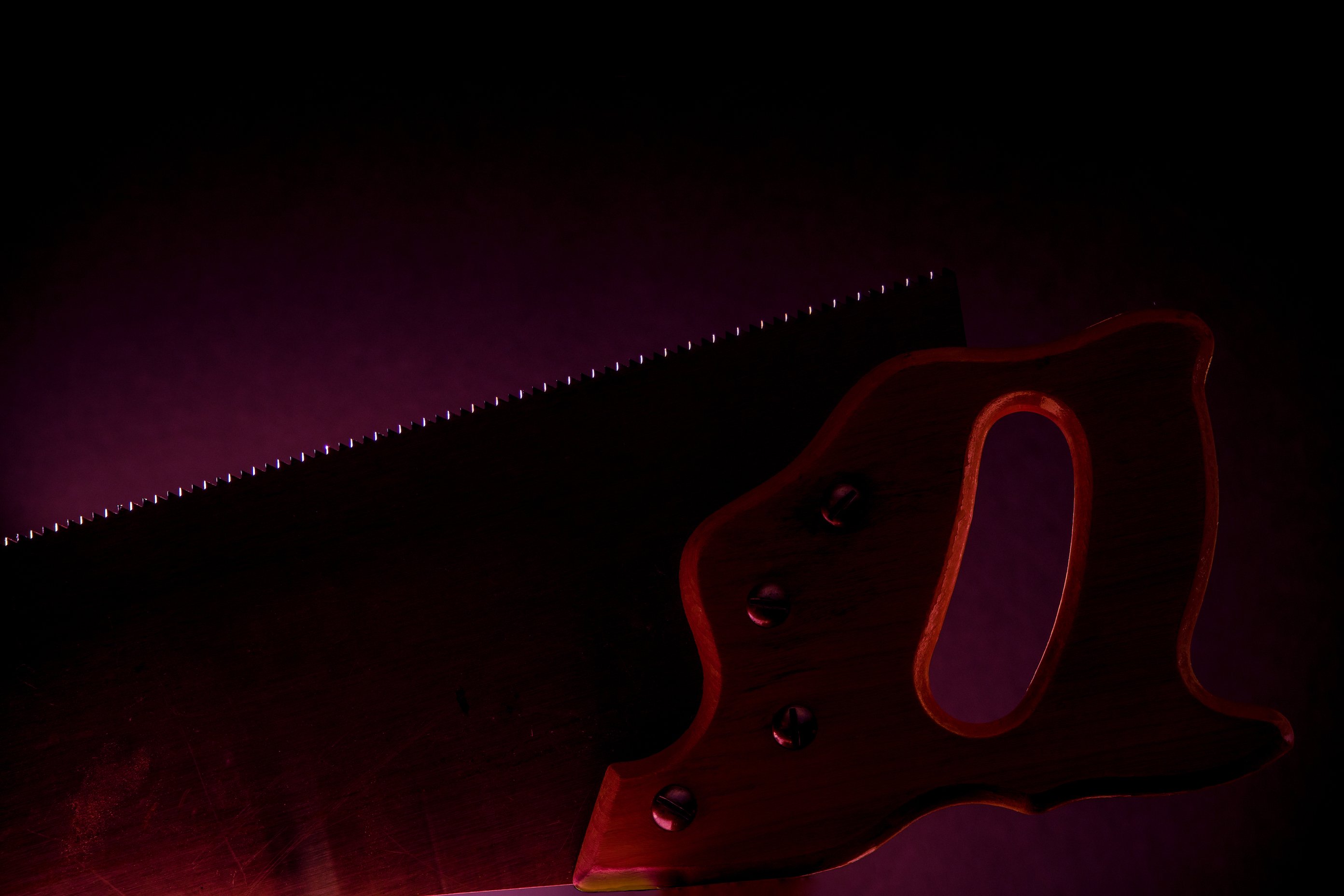
2021 Photo Critique Group Challenge: Jagged Click to view larger image. Sandy says: I borrowed my husbands's handsaw, used a flashlight to back light it and a long exposure in a dark room to emphasize the jagged teeth. |
|
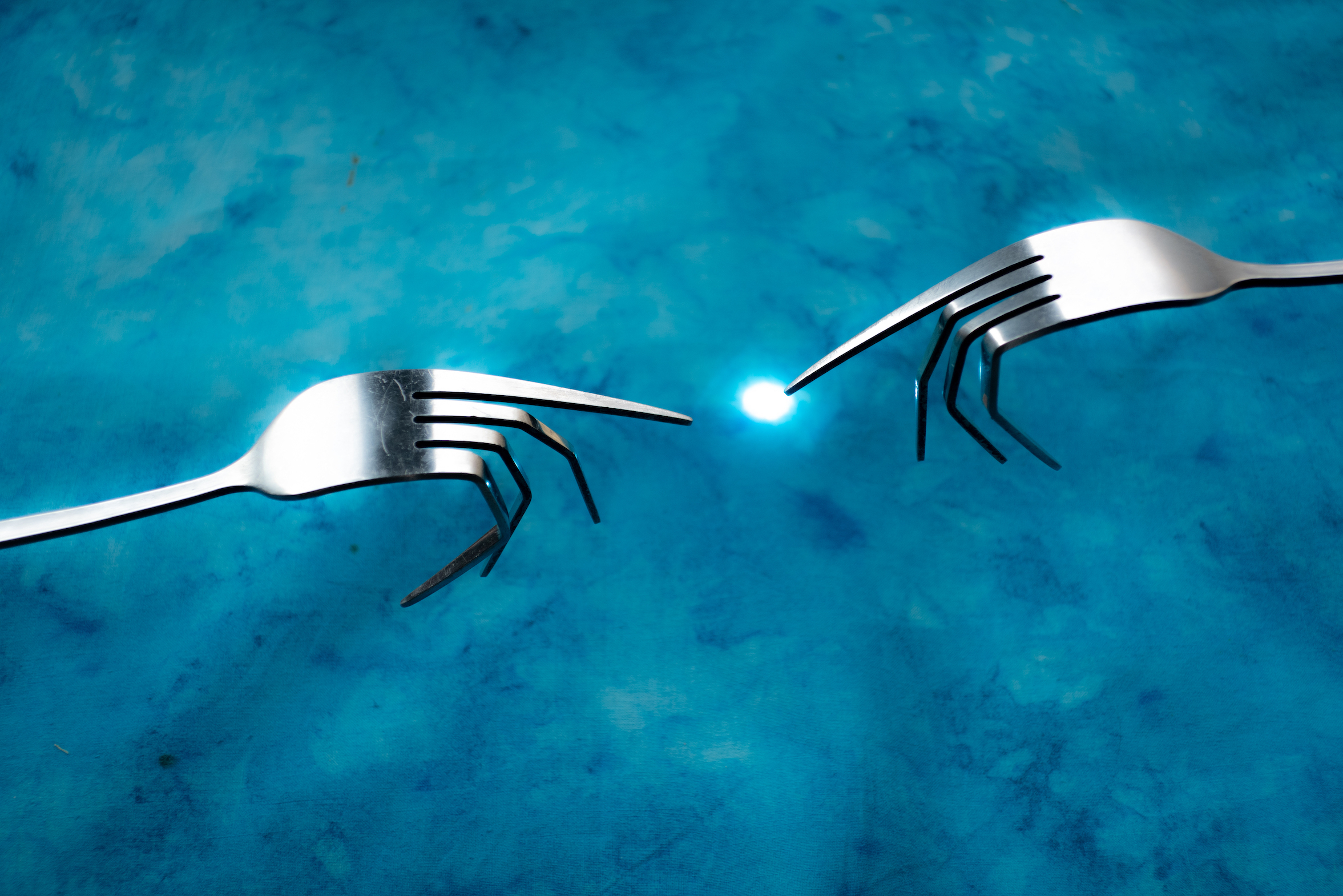
52 Week Challenge Class Challenge: Forks Click to view larger image. Scott says: Background hand-died fabric by Cassie Conway. Forks suspended in space with vice grips 4" above fabric. Lens flare created by iPhone "flashlight" under fabric. Tripod, full manual. Shutter remotely activated with iPod. Natural light through window. Highlights +100, shadows -100, clarity -55, whites +26, blacks -16 |
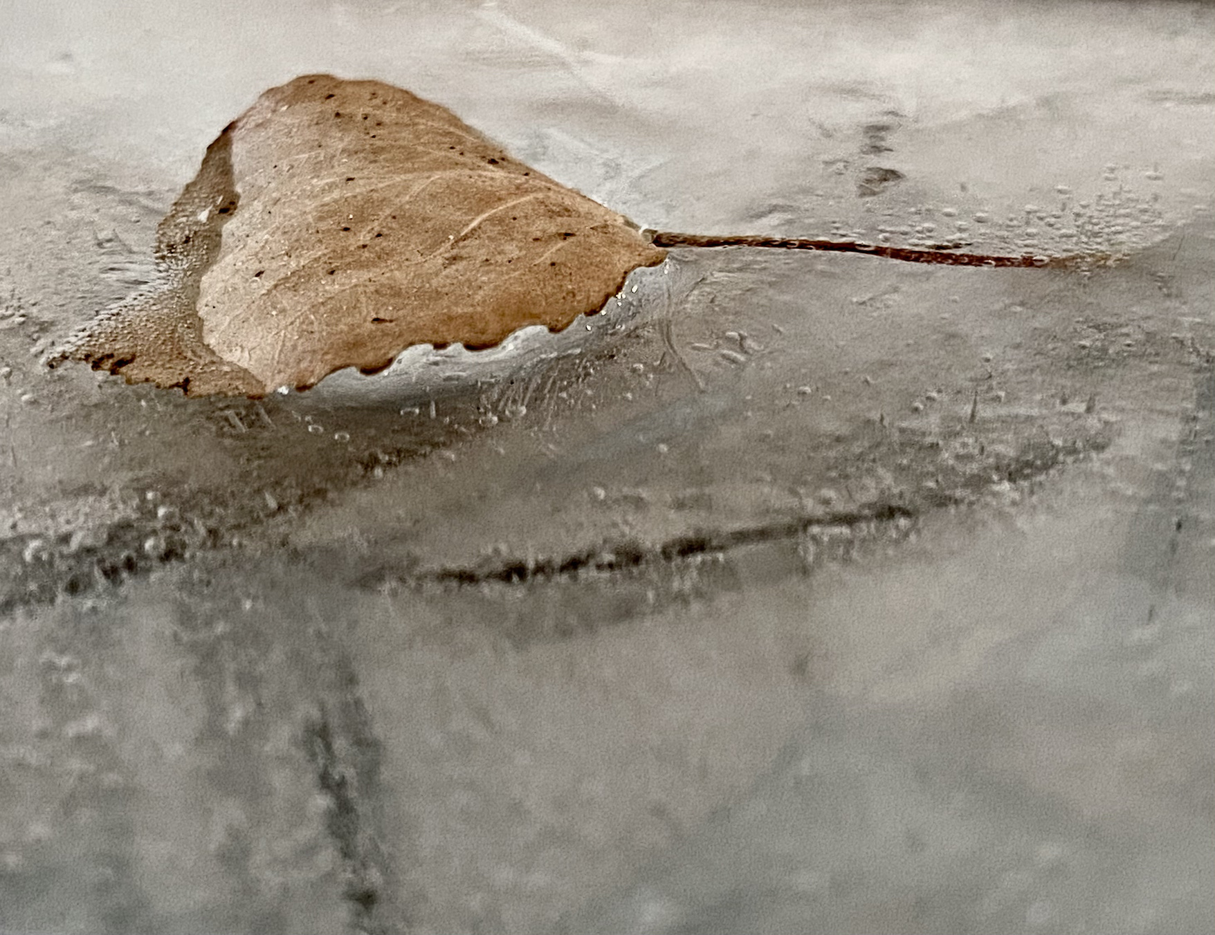
2021 Smart Phone Challenges Challenge: Single Leaf Click to view larger image. Charlotte says: It’s been extremely cold around here this week. -25 to -35 C cold! So I haven’t been venturing outside much this week. Last night I found a leaf under some snow just outside my back door. Put it in a bowl of water outside and waited for it to freeze. |
|
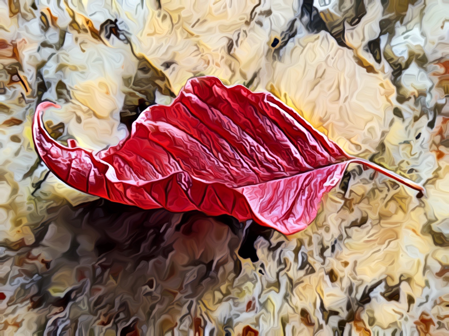
Ricky's Challenge Photos: Challenge: Single Leaf Click to view larger image. Ricky says:
|
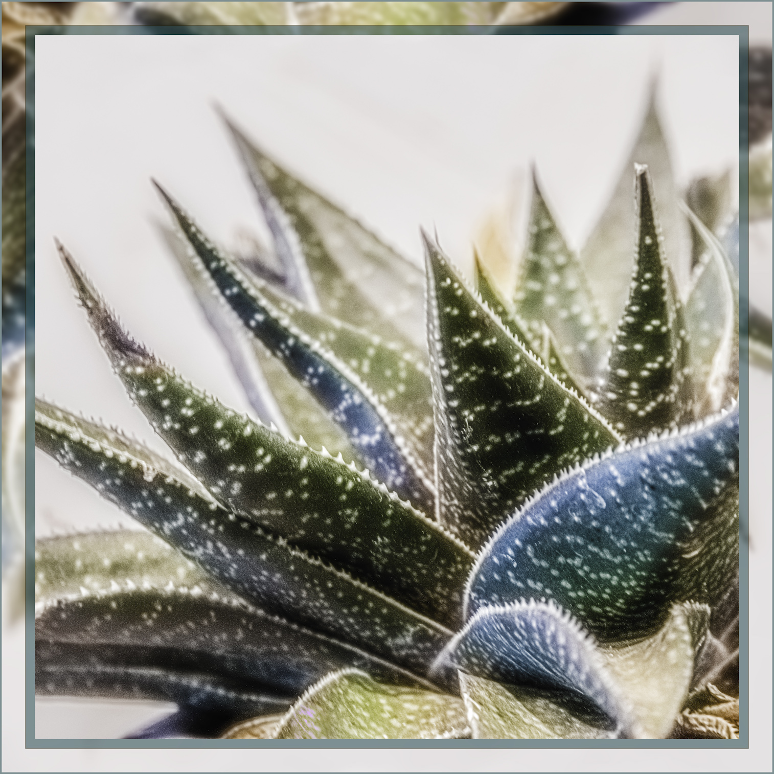
Challenge: Jagged Click to view larger image. Ricky says: This is my gastro aloe that has survived my black thumb now for three years and has sent up a bloom spike about 6 times. It's showing age, but it's definitely one of the most jagged subjects I had around. Cropped square. Edited to a high key BnW - then exported both the high key and the color edtied and did a BnW dreamscape, with the BnW sharp, and the color out of focus. Because of the white edge, I decided to add a frame so there was an obvious frame edge. My frame is the photo rotated 180˚, then blurred and enlarged so to fit the expanded canvas. |




All comments are moderated. (Links not allowed)