Photos of the Week - Week 28


Critique Group Challenge: 

Week 28, Film Noir

Photo by Bill Arneson

Click to view a larger image 

Bill says:

A backseat view through a windshield of a young woman with concern in her reflected eyes of what is ahead on a deserted road. It is meant as a play on the film noir technique of a closeup of a potential victim and the danger suggested by the setting.

This is a composite, cut and pasted to the background. I started with a view of the back of her head leaning toward the rear view mirror, but that was too busy so the photo was cropped to exclude that, the dash and roof edge to focus only on the road and the eyes in the rearview mirror. Film noir elements include low key, high contrast, B&W with +8 Temp for a slight sepia tint and an uncommon camera angle. A chrome rearview mirror (’57 Chevy) was used to frame the eyes as a black frame blended too much. I went for an element of concern/danger in the reflected eyes, which was my Granddaughter’s response to a request for that look. The background was a previous photo, which reflects the metadata.


52-Week Photo Challenge Class
Week 28 - Distort / Liquify


Week 52 Photo Challenge:

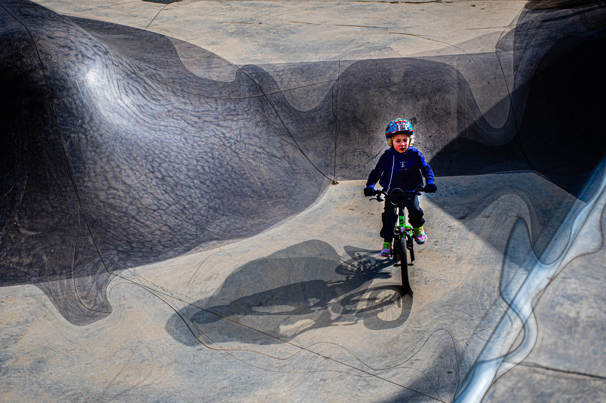
Week 28, Distort / Liquify

Photo by Wendy Browne

Click to view a larger image.

Wendy says: 

I think I have probably overstepped Ricky’s mantra that “just because you can, doesn’t mean you should” and “too much of a good thing is not a good thing”.
This is an image of my 6-year-old Grandson at the local skate Park.
Feeling very brave he dropped down into the pit and rode around. I though this had possibilities for “Liquify” so took many photos.
I took my favourite into Photoshop and then thinking, “what would happen if?” duplicated the image twice.
I liquified both images differently and then added one on multiply blend mode and then the other, also on multiply. Flattened the layers and back to Lightroom.
There I used a mask to lighten Owen’s body.
I like it, though it may not be what Ricky had in mind!


Smart Phone Photo Challenges
Week 28 - Visual Rhythm 

Smart Phone Challenge:

Week 28, Visual Rhythm 

Photo by Linda Rowberry

Click to view a larger image.

Linda says:

A mall in the Salt Lake Valley has painted some of the building with fun designs. I liked this one the best as it shows a lot of rhythm.

Ricky's Challenge Photos

Smart Phone Challenge:

Week 28, Visual Rhythm 

Photo by Ricky Tims

Click to view a larger image.

Ricky says:


\

Critique Group Challenge:

Week 28, Film Noir

Photo by Ricky Tims
from the 2022 Critique Group

Click to view a larger image.

Ricky says:

Best laid plans gone arwy. When I opened my options on the computer I had badly failed in focus - so - I went extreme out of focus and blurred the image more. It's not the vision I was originally going for, but we all know how the situation will take us in a different direction. 


Add comment

All comments are moderated. (Links not allowed)


Security code
Refresh

Ricky Tims Online Store

Ricky Tims Photography 

The Quilt Show